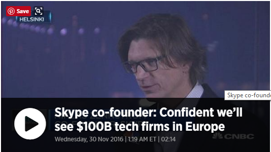
In this video Niklas Zennström (co-founder of Skype) says he’s confident Europe will have technology firms that rival the likes of Facebook in the next 10 years. Given his background it’s intriguing to me that his views are not more global, although he does mention in the video that it’s less important where a company chooses to become publicly listed.
I find myself wondering whether the ‘tech world’ will become increasingly global, such that it won’t matter where a company is listed and it won’t matter where their employees are situated either. For example, a UK based company I work closely with on the development of the online learning community I manage (I’m resistant to it being labelled an ‘LMS’), has part of its technical team in Roumania. This is not outsourcing in the traditional sense, this is an extension of the UK team into another country.
Other than the difficulties sometimes presented by time-zone differences and to a lesser extent cultural differences, I can see no reason why teams cannot be made up of individuals from across the globe, continuing to live in their current location but working together in one common ‘place’ online. I’m sure CERN must have been doing that for years and looking to the education sector the MOOC model has already established how course groups from diverse locations and cultures can work collaboratively.
I enjoy watching a good game of Rugby Union. In recent years the introduction of a Television Match Official (TMO), slow motion replays from every angle and a body camera worn by the referee have, in general, added to the spectacle and safety of the game. These innovations have indeed ‘made visible the invisible’, but is this always a good thing?
Rugby meme from scontent.cdninstagram.com
Minor infringements of the rules, or more accurately, what can appear to be an infringement when viewed in slow motion, or from a particular angle are often reviewed by the referee and played back on screens where they can be viewed by the spectators. In some scenarios this can add exciting tension to a game, such as when it’s unclear whether the ball wall grounded and a try scored. However, in other cases tackles that appear high or late can appear much worse than they did in real time. In these circumstances it must take a strong-willed referee to ignore spectators spurred on by the on-screen images and baying for a yellow or red card to be awarded. There have been many instances where I’ve suspected that the referee has been influenced by the crowd’s reaction.
At the same time the referee’s camera provides a close up view of the ball being put into a scrum, which in my view is never straight, such that the opposing side’s hooker has almost no chance of getting a foot on the ball. This seems to have become such an accepted state of affairs that there is no crowd reaction and players are never penalised for the obvious infringement of the rules.
So what has all this got to do with Algorithmic Cultures? As Knox, J. (2014) suggests, learning analytics also ‘makes visible the invisible’’. We saw some of this in the Tweetorial analysis last week. Without analytics would we have had any idea of the gender balance between participants? Would we have known who had the most mentions?’ More importantly are either of these statistics important, or are they more likely to obfuscate and detract from more relevant statistics? Both of these stats have been at the heart of some debate amongst Tweetorial participants, both on Twitter and in blogs. Whilst there hasn’t been the equivalent of the rugby crowd baying for blood, there has been some tongue in cheek analysis and suggestions of possible ‘gaming of the system’, neither of which might have come to light without the automated analytics making the relevant statistics visible.
Is ‘making visible the invisible’ always a good thing? If it leads to healthy debate and new insights maybe it is. Where it distorts and leads to unnecessary conflict I believe it can be detrimental to our efforts as educators.
Reference:
Knox, J. (2014). Abstracting Learning Analytics. Code Acts in Education ESRC seminar series blog.
Being actively engaged with a topic inevitably heightens one’s senses to any mention of it in everyday life. One such example of this occurred this morning during my commute to work. Half listening to the BBC’s Today Programme during the morning commute the subject matter turned to cyber security and I was immediately more attentive.
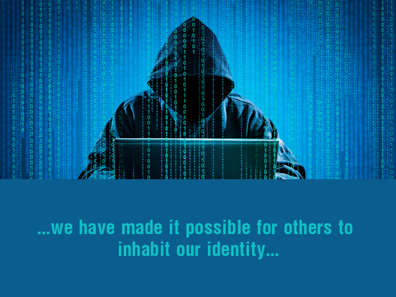
The item was referring to the use of social media tools by terrorists, both from a propaganda and organisational perspective, and the inability of security agencies to access encrypted messaging sent and received during the recent attack in London.
The debate centred on the relative benefits and pitfalls of social media providers creating a key or ‘backdoor’ to enable the security services to access encrypted messaging. The opposing view presented was that the rest of the public would suffer a loss of privacy as a result and that such a backdoor would create a vulnerability that would be open to exploit.
This feels like another example of what Sian Bayne refers to as ‘complex entanglements’ (Bayne, S. 2014). None of us want terrorists to be provided with unhindered means of organising attacks, and many might consider a loss of privacy a price worth paying. But what if that loss of privacy allows state sponsored meddling in our democratic processes. What if our own security services were to misuse their powers and routinely access our day to day communications? (the ‘snoopers charter’ debate).
This all felt very pertinent to the privacy aspect of this ‘Algorithmic Cultures’ block. In one context collecting and presenting data in a particular way might appear entirely appropriate. Perhaps what we need to consider is how else the data we collect might be used and by whom.
References
Bayne, S. (2014) ‘What’s the matter with ‘technology-enhanced learning’?’ Learning Media and Technology 40(1), pp.5-20
A work project moving from the planning phase into full on delivery, together with commitments over the weekend, left precious little time for blogging last week. However, I did manage to find several periods of time over the week to write the required analysis of the Tweetorial. I’ve since had a few more thoughts on the use of Twitter for education and I will either add these to the analysis or create a separate blog post.
The fact that I have what amounts to some self-imposed analytics on my Lifesteam, in the form of the calendar of blog posts, hasn’t escaped me.
Calendar of blog posts
I included the calendar for two reasons, firstly because I thought it might be helpful to future students of this course who visit my blog and secondly because it’s a reminder to me of the course requirement to ‘add to the Lifestream almost every day’. The irony of this is that the Tweetorial analysis I worked on over several days only shows as a single post – another example of analytics not necessarily ‘making visible the invisible’.
As part of my current work project I’m using Articulate Storyline to create a tool that will enable our practice managers to review their current knowledge and use their input to point them to resources that will help them. This has involved creating a means of filtering their input, which has required a multi-stage approach and several hundred conditional triggers. In effect I’m writing my own algorithm and it will be interesting to apply some of the thinking I’ve done around Algorithmic Cultures to how the tool might be viewed by those it’s intended for, and by others in the business.
The Tutorial on Friday was lively and useful. It was interesting to hear everyone’s views on the Tweetorial and the Algorithmic Cultures block. In common with my fellow students my thoughts are now turning to tidying up my blog, continuing to add metadata and starting preparation for the multi-modal essay.
How has the Twitter archive represented our Tweetorial?
1. Ranked league tables
from http://www.eventprophire.com
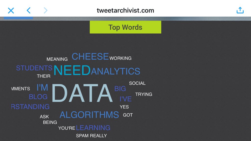
The first thing that struck me about the analytics is that many of them are ranked and use words like ‘top’ or heat-map style representations with most used words or most frequently mentioned contributors shown in decreasing order of size on the graphic.
Studies such as Cherry, T. and Ellis, L.V. (2005) indicate that that norm-ranked grading drives competition. Whilst this not the intention of the analytics I did find myself taking an interest in where I ‘ranked’ in the various tables and charts and had some sense of achievement in appearing in the ‘top’ half or higher in most of them.
This sense of achievement is, of course, entirely spurious. Most of the results indicate quantity rather than quality. Siemens (2013) raises this as an issue “Concerns about data quality, sufficient scope of the data captured to reflect accurately the learning experience, privacy, and ethics of analytics are among the most significant concerns” . Dirk’s Tweetorial analysis highlights this well and he asks a similar question “Is any of the presented data and data analysis relevant at all? Does it say anything about quality?” While it doesn’t for the use we are making of it, for a marketeer knowing who the key influencers are would be very useful.
2. Participation
I was working from home on the day of the Tweetorial so was able to join in for several hours. Borrowing from Kozinets (2010) classifications of community participation, my own contribution to the event felt like a reasonable balance between ‘mingler’, ‘lurker’ and ‘insider’. The quantitative nature of the analytics does not enable any distinction between these types of participation.
The high number of mentions I had was largely due to my experiment early on in the day, attempting to ‘attract’ algorithm driven followers through keywords. I had noticed that I was gaining followers from the data analytics and artificial intelligence fields, presumably based on the content of my tweets, so I decided to try tweeting the names of cheeses to find out if this yielded similar results. Helen took up the theme and ran with it and this became the source of some playful behaviours and social cohesion over the course of the day. A good example perhaps, of the first follower principle illustrated in Derek Sivers’ (much debated) theory illustrated by his ‘Leadership lessons from dancing guy’ video:
3. Most used words
Interestingly the word Cheese and other words such as ‘need’ that appear quite prominent on the heatmap below shared by Anne, do not appear on the analytics linked from the course site. This is likely to be due to the capture period selected and, if so, it illustrates how statistics can be manipulated both intentionally and unintentionally, to convey a particular narrative.
The most used words seem to be fairly constrained, words I’d expect to see given the nature of the questions are there, but having taken part in the Twitter ‘conversation’ I can see that they do not capture the diversity of the topics discussed. Some of the more diverse words do show up in the hash tag heat map.
Cathy’s Thinglink summary of the Tweetorial points out the frequent use of the word ‘perhaps’ and she offers a possible explanation “It may reflect a tentative and questioning aspect of some tweets”. I know I tend to use the word when I have not qualified a statement with a source, or I feel I’m interpreting a source differently to the way the author intended, so this might be another explanation…perhaps.
Overall, while the analytics imposes some order on the presentation of the data, human interpretation by someone who was present during the event (shades of the ethnography exercise here) are necessary to make sense of them. As Siemens (2013) points out “The learning process is essentially social and cannot be completely reduced to algorithms.”
What do these visualisations, summaries and snapshots say about what happened during our Tweetorial, and do they accurately represent the ways you perceived the Tweetorial to unfold, as well as your own contributions?
1. Volume over time
This is another example of the time frame used providing only a limited insight. In this case the fact that the number of tweets increased markedly on the days of the Tweetorial is hardly an insight at all. I’ll refrain from using a popular British idiom involving a fictional detective here, but this would have only been an insight had the reverse been true, or there had been no increase. Had they happened both of these alternatives scenarios would also have required human interpretation to make any sense of them.
A more useful time frame might have been 15 minute slots over the course of the two days (or even each minute), as the data could then have been aligned to when new questions were asked by Jeremy or James. It would then have been possible to see the different levels of activity following each question and pass judgement on which were the most effective at generating debate. However, even with a greater degree of granularity it still wouldn’t have been possible to attribute an increase in activity to a tutor question, as it could also have been due to a supplementary question being asked by one the students.
2. The contribution of others
The user mentions heat map has Jeremy and James as central to the discussions, presumably because a lot of the tweets were posted as replies to their questions. While they were active contributors I don’t think they were as central to the discussions as the heat map would suggest, indeed the focus moved around between contributors as the discussions progressed.
3. My own contributions
I’ve already made some observations about quantity versus quality and the top-tweeter, Philip, has rather humbly (unnecessarily so) made similar self-deprecating comments about his own contributions.
Being purely quantitative the analytics would provide no useful data, if student’s contributions were being assessed and graded for educational purposes. I made a similar point during the Tweetorial – simply counting the number of tweets is similar to the way some learning management systems count learning as ‘completed’ if a learner opens a pdf or other document.
As well as academic discourse I believe some social interaction and risk taking by participants is good for healthy debate, but again the limited analytics we have available do not provide any insights into this type of community participation.
4. Images
I’m not sure if it’s because I’m a particularly ‘visual’ person, but I found the images give by far the most accurate representation of how the tweetorial felt to take part in. They capture both the academic and social aspects of the conversations and they provide a useful ongoing resource.
What might be the educational value or limitations of these kinds of visualisations and summaries, and how do they relate to the ‘learning’ that might have taken place during the ‘Tweetorial’?
1. The format
As a medium for education the format would take some getting used to. The multiple streams of discourse can be difficult to follow and I felt the conversation had often moved on by the time I reflected on a particular point and formulated my answer. I experienced a very similar situation during a previous course when I took part in a synchronous reading of one of the set papers and an accompanying Twitter chat. It was soon clear that everyone read at a different pace and before long the whole thing was out of sync and one paragraph was being confused with another. Tools such as Tweetdeck and Hootsuite do help visualise the conversation by allowing the user to split a continuous stream into multiple columns, for example one column for a specific person, another for key word(s) and so on.
I see some potential as means of kick-starting a discussion, the pace and multi-modality can generate a lot of ideas and links to resources very quickly. Follow up activities could then explore the various threads in more detail, with further Tweetorial(s) to reinvigorate any topics that slow down or stall.
In this experiment there was some value in not knowing exactly what analytics were going to be recorded, as this made it less likely that our behaviours would be influenced. Personally I had forgotten there would be any analysis by the time the second question was asked. If was going to use this format with my learners and analytics were going to be used I think I would adopt an open model and be clear up front about the limited nature of what was going to be recorded and how it would be used.
2. The analytics
In his blog Abstracting Learning Analytics post Jeremy Knox writes “… my argument is that if we focus exclusively on whether the educational reality depicted by analysis is truthful or not, we seem to remain locked-in to the idea that a ‘good’ Learning Analytics is a transparent one.
In this blog post Knox refers to a painting of Stalin lifting a child and points out that there might be more to be understood from abstracting this depiction than might be gained from “attempting to come up with a new, more accurate painting that shows us what Stalin was really doing at the time.”
So, what if we take a more abstract view of the depictions of the Tweetorial presented by the Tweet Archivist analytics? Following Knox’s lead perhaps the real questions we should be asking include:
Why have these particular data been selected as important?
Why is the number of mentions an individual receives considered more important than, for example, the number of links to external resources they provide?
Why is a ranked or heat map view used rather than a spider graph or other mechanism that might better demonstrate connections?
Knox brings this idea of taking a more abstract view of analytics back to education “What may be a far more significant analysis of education in our times is not whether our measurements are accurate, but why we are fixated on the kinds of measurements we are making, and how this computational thinking is being shaped by the operations of the code that make Learning Analytics possible.
In the case of the Tweetorial, analytics were provided to us, possibly in the knowledge that they would raise precisely the sort of ‘lack of transparency’ questions I have discussed above. In reality I could take Dirk’s example a step further and carry out my own data collection and analysis, or used a different tool such as the tool shown below ‘Keyhole’, which provides additional views such as ‘sentiment’ scores percentage of tweets that are positive, negative or neutral and any gender bias.
Analytics from keyhole.co Click image to open in higher resolution
Similarly, in my own professional practice I could take a critical look at the data we’re collecting and ask some fundamental questions about what it tells us about our organisation and what we value in our learners.
References:
Cherry, T. and Ellis, L.V. (2005) Does Rank-Order Grading Improve Student Performance? Evidence from a Classroom Experiment, International Review of Economics Education, volume 4, issue 1 (2005), pp. 9-19
Siemens, G. (2013) Learning Analytics: the emergence of a discipline. American Behavioral Scientist, 57(10): 1380-1400
Kozinets, R. V. (2010) Chapter 2 ‘Understanding Culture Online’, Netnography: doing ethnographic research online. London: Sage. pp. 21-40.
Sivers, D. TED talk ‘How to start a movement’ https://www.ted.com/talks/derek_sivers_how_to_start_a_movement
As well as taking part in the Tweetorial activity this week I’ve started to go back through each weeks reading and update / add posts where I have more to say, or where I feel I now have a better understanding of the topic.
A TED talk by Amber Case, that I happened upon when researching Haraway, D (2007) has featured in several of my posts as, for me, some of the concepts she discusses resonated with all three blocks of the course. I created this visual artefact in response and have updated my thoughts on cyborgs and aspects of digital communities here.
I’ve started to pull my Tweetorial tweets into an order and I was intending to add some commentary to them, although I’ve now seen that a much more in depth analysis of all the activity is required so I’ll focus my attention on that instead. It was an interesting exercise in social learning and, because it was carried out in the public domain, it illustrated some of the concepts around community and algorithms very well. My attempts to entice Twitter bot followers with keywords failed miserably, but worked when I wasn’t actually trying. This was the original source of the cheese related content, which in itself illustrated some interesting social cohesion, particularly once @helenwalker7 had taken up the challenge and run with it!
I’ve also started adding more metadata to many of the links embedded via IFTTT to indicate why I linked them and to expand on the points raised in the linked articles and videos (this for example). There’s more to do and some general housekeeping to make the whole blog more navigable, but I feel this weekend’s efforts have moved my understanding a step or two up the ladder.
“By the late twentieth century our time, a mythic time, we are all chimeras, theorised and fabricated hybrids of machine and organism; in short, we are cyborgs. The cyborg is our ontology;
it gives us our politics”
Haraway, D (2007) A cyborg manifesto
References:
Haraway, Donna (2007) A cyborg manifesto from Bell, David; Kennedy, Barbara M (eds), The cybercultures reader pp.34-65, London: Routledge.
Most images are composites constructed from iStock and Google Images
Remixed here by Dirk Schwindenhammer:
Let the intellect alone, it has its usefulness in its proper sphere, but let it not interfere with the flowing of the life-stream. Daisetsu Teitaro Suzuki